
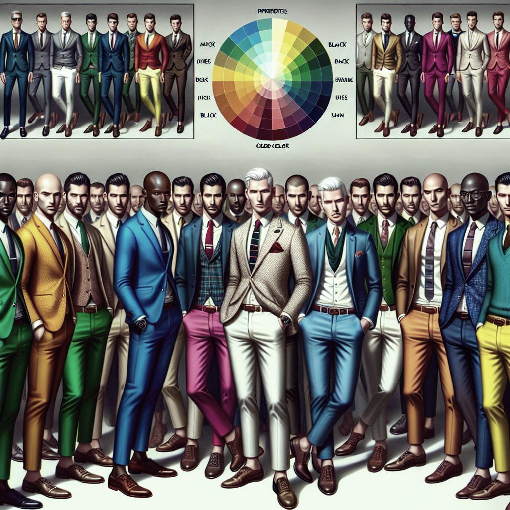
Color Combinations to Avoid in Men’s Fashion
Color is a crucial element in crafting a stylish wardrobe, but navigating the world of color combinations can sometimes feel like deciphering a complex code. This guide seeks to demystify men’s fashion by exploring color theories, identifying problematic pairings, and offering practical advice on selecting hues that complement individual skin tones. We’ll dissect common pitfalls in style, examine the dynamics of black and white, and look at the impact of color repetition. Additionally, we’ll invite you to share your thoughts on difficult colors and provide actionable steps to refine your fashion sense. Whether you’re stepping up your professional appearance or experimenting with casual looks, understanding these concepts could be your springboard to sartorial success.
Color Theories: It Feels Like Something’s Missing
Color theory is the backbone of any good style guide, and understanding its basics can significantly enhance your fashion decisions. The color wheel, developed by Sir Isaac Newton in 1666, remains a vital tool for matching hues. It consists of primary colors (red, blue, yellow), secondary colors (created by mixing primary colors), and tertiary colors (a combination of primary and secondary colors). Recognizing these combinations can lead to harmonious outfits.
However, relying solely on the color wheel might leave you feeling something is missing. Real-world applications often require considering the context of colors, such as undertones and the overall vibe you want to project. This is where the blend of art and science in color theory gets truly fascinating. Combining colors isn’t just about aesthetics; it’s also about emotional connections and psychological effects, making it an essential tool for curating your wardrobe.
Never Go Naked Again!
Avoiding fashion missteps starts with understanding how different colors interact. Certain combinations can be too jarring or muted, leading to outfits that don’t effectively communicate your style. For instance, pairing overly similar colors lacking contrast can make your ensemble appear monochromatic and uninspiring. Conversely, clashing bold hues might make it difficult to focus, distracting from the overall aesthetic.
Common pitfalls include pairing colors that sit too closely on the color wheel, such as a red shirt with orange pants. By diversifying your choices and seeking complementary colors, you can ensure you’re never left wearing an outfit that feels lacking. The goal is to strike a balance that is visually appealing and expressive.
Which Colors Should I Wear?
The key to choosing the right colors is understanding your skin tone. Warm skin tones are complemented by earth tones like olive, rich reds, and creamy hues, while cool skin tones benefit from jewel tones such as sapphire, emerald, and deep purples. Neutral skin tones have the flexibility to explore a broad spectrum, from pastels to bold colors.
Seasonal color analysis can also guide color choices, suggesting palettes that fit the “seasons” of your complexion. Determining whether you’re a spring, summer, autumn, or winter can make selecting colors intuitive, helping you curate a wardrobe that naturally complements your skin tone.
The Colors You Wear Too Much Of
While comfort in your color choices is valuable, over-reliance on certain colors can limit the versatility of your wardrobe. Black, for instance, is a frequently overused color that, although slimming and elegant, can appear monotonous if worn frequently without variation.
On the opposite spectrum, colors like bright orange or yellow, when overdone, can overwhelm your look. Balance is critical in ensuring that standout pieces are complemented by neutral staples, creating a harmonious overall look without clashing.
The Case of Black and White
Black and white are classic, timeless choices, but pairing them often demands careful consideration. Too much black can be severe, while too much white can sometimes feel too stark or clinical. However, when balanced correctly, these colors can exude sophistication and elegance.
The secret lies in the details; textures, patterns, and additional colors can break the monotony. Layering can also add depth, transforming basic black and white into a canvas for interesting accessories or statement pieces that infuse character into your outfit.
So Stop Worrying About Colors and Start Thinking About Contrast!
Contrast is an essential aspect of creating engaging and dynamic outfits. It’s not just about choosing different colors but understanding how light and dark shades interact. High-contrast outfits tend to be more striking and formal, ideal for business or evening wear.
In contrast, low-contrast combinations offer a subtle and relaxed appearance suitable for casual settings. By strategically implementing contrast, you can guide the eye to specific areas, accentuating features and allowing certain elements of your attire to shine.
Which Colors Should I Wear if I’m Black, Asian, Hispanic…?
Cultural backgrounds and skin tones play a crucial role in determining the most flattering colors. Individuals with darker skin tones can indulge in vibrant and bold colors that emphasize their rich pigmentation, while earthy tones can provide a grounded look.
For those with lighter or medium skin tones, a mix of soft pastels or vibrant shades can enhance warmth and radiance. Delving into the specifics of cultural influences can also add another layer of personal expression to your fashion choices, allowing you to celebrate heritage through color.
Repeating Colors in My Outfit – What Do I Do About That?
Repeating colors can unify an outfit, but overdoing it can result in a lack of contrast. For instance, wearing different shades of blue can be stylish if balanced with neutrals or accented with pops of a contrasting color.
The key is moderation and careful selection of accompanying hues that prevent the look from becoming one-dimensional. Accessories, shoes, and even hairstyles can offer the opportunity to diversify the color palette, adding layers to your style without overwhelming the main elements.
Your Answer in the Comments: What Are the Most Difficult Colors to Use in an Outfit? Pink, Yellow? I’ve Also Heard That Green Was a Problem Sometimes? Is That Right?
Some colors present a challenge in styling because they can clash easily or overpower an ensemble. Pink, for instance, can be tricky due to its boldness, but pairing it with neutral tones can create a balanced look. Yellow, on the other hand, brings radiance but requires careful consideration to avoid washout.
Green is often seen as problematic due to its varying shades, each invoking different moods and tones. The right combination requires thoughtful pairing and an understanding of the setting in which it will be worn. Share your toughest color dilemmas in the comments; discussing individual experiences can offer valuable insights and solutions.
Postscript.
While style is inherently personal, understanding color dynamics can transform your fashion journey. With these insights, you’re equipped to navigate the complex landscape of color combinations and make fashion-forward choices. Explore beyond traditional boundaries, and remember that the most important aspect is how your wardrobe complements and empowers your individual expression.
As you experiment with different hues, keep an eye on market trends but remain true to your style preferences. Use the summarized tips below as a guide in your ongoing exploration of men’s fashion.
| Aspect | Key Points |
|---|---|
| Color Theories | Understanding basic color wheel concepts and emotional impact of colors. |
| Common Color Pitfalls | Avoid similar colors lacking contrast; seek complementary hues. |
| Skin Tone Considerations | Matching colors with warm, cool, and neutral skins for harmony. |
| Overused Colors | Black can be monotonous; bright colors can overwhelm. |
| Black and White | Balance with texture and accessories for sophistication. |
| Contrast | Utilize light and dark shades for striking vs. subtle outfits. |
| Cultural Influences | Embrace colors that reflect skin tone and cultural heritage. |
| Repeating Colors | Moderate repetition with neutrals and contrasting accents. |
| Challenging Colors | Consider setting and complementary tones for tricky colors like pink, yellow, and green. |

